AMERICA 250 LOGO
Randi Wolf
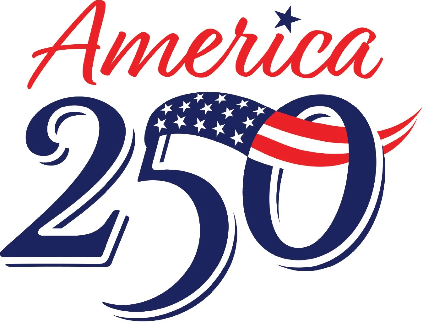
A copywriter who I worked with around 40 years ago contacted me to work on this logo, to be used on a product he invented for America’s 250th anniversary – an illuminated flagpole (see https://onenationflag.com). Working with him again as a “team” brought me back to our Philadelphia Ad Agency days, where we would collaborate back and forth to come up with the best creative ideas, laughing and smiling all along, because it was always fun. I used to joke about how his name was “Art” but I was the one who did the art!
For this logo, Art came up with the concept of having the vertical stroke of the “5” form a flagpole, with the top of the “5” being a flag. I suggested we extend the flag to the right and make it wave and go through the hole of the “0”. I felt this would make it more dynamic-looking. I also designed it with a type treatment that reminded us both of the 1776 days, where often some numerals hung down below the baseline. (Full disclosure: Art actually liked a very slight variation of the logo shown, but he told me I could use this one for my own self-promotion.) Just goes to show you…after 40+ years, we still make a great team!